Tuesday, 28 December 2010

Never mix champers and Trib Too's

Santa done goooooooood !


Ok so littttle Christmas prezzie to moi, but absolutely B-E-A-UTIFUL !
1.5 inch platform, 6 inch heel, grey suede, Italian leather, gold mirrored heel ... need I go on !
Just recently, I've started going a tad higher with the heels on my shoes, I love how the higher the heel the skinnier your legs appear to be. This is my first pair of YSL's, I was told by a friend that they were comfortable and easier to walk in than many other 6 inch heels, and with the 2 Louboutins I have thought it was time to try someone else . . . and my god I'am glad I did! .
These are a must for New Years !!!


Saturday, 25 December 2010

Twas the night before christmas ......... and I bought D&G

Very poor photograph of a gorgeous top I bought at work today !
Its a silk-chiffon babydoll, in cream/black bow print from D&G's s/s 2010 range.
My plan is to wear it for Christmas dinner with the family tomorrow, by pairing it with skinny jeans and my YSL trib too's that Santa's dropping off tonight ;)


Thursday, 23 December 2010

YSL cosmetics

I ran out of my favourite Clinique foundation last week and since then I've been using my back-up. On Friday I had my make-up done by my friend Julie, she used all Mac foundation for the night however recommended YvesSaintLaurents Teint Radiance. Being lucky enough to get discount in the beauty department at work I picked some up on Tuesday, and after using it last night before cocktails, I can't believe how nice it is ! It makes your face look really smooth but doesn't make you orange or unnatural ! It also smells lurrvely !

Saturday, 18 December 2010

That was fun !

After completing my photo-shopped images, and all the research for the study, I can say that this unit has been my favourite since starting college.
I've seen so many friends and artists use photo-shop, I also to some extent in high school, but through this brief I have learnt to use it in different ways. For example, I only ever used the programme to edit photographs, yet now I know how to improve my drawings using simple tools within this programme.
My "Bridgets Back" piece was my favourite as I used layering effects to add a variety of textures to my piece, and it was the one piece of work I created that clearly used traditional and contemporary styles together.

Photo-shop has hundreds of tools, therefore to improve further I need to practice using it more often to further my skills, also by taking more time with the pieces I edit, I'd achieve a more professional finish.
I also really enjoyed the research part of this unit, as I was able to look into a mixture of areas in the fashion industry and see how widely used computers are in every job.
The best thing of all about this unit, was using the blog. It makes things very easy to stay on track of, and is very easy to add too. Using my blog for this unit has definitely made me see how much more practical it is as opposed to a hand kept journal. And I now want to keep on top of my blogging and post more regularly.

Tuesday, 14 December 2010

THE photoshoot :)

Whilst on the subject of airbrushing, it gives me perfect opportunity to make a post on the AMAZING photographs I just received back from my recent photoshoot from my birthday. Like I said I LOVE the airbrushed look found in so many fashion magazines, and therefore was ridiculously happy with the results from my shoot.

My photoshoot was done by STUDIO 900's John McCulloch ( http://www.studio900.co.uk/ ). The entire day was amazing ( including the interval for me and the girls to sneak in a few cocktails down the road at Gusto ) and comments I have received on the pictures since have been lovely.
The Photoshoot took place on October 29th, and within a week my photos were ready to view and choose final images. Now all the chosen pieces are produced as a coffee table photo album. and after seeing the layout he designed last week, I'am now really excited to see the final outcome.

Although I don't think i could pick 1 favourite here are a few that I really love !

And finally .... Fashion Photography !

My personal favourite area in which digital techniques are used has to be photography, Something that has always interested me was how all the supermodels in vogue would look so amazing and skinny, the answer is Airbrushing. After seeing a professional photographer use an airbrushing tool on his work, I think its one of the best techniques a computer can offer. I find it amazing how a average photograph can turn into an amazing work of art with a high resolution glossy finish. Airbrushing tools can be used for simple things like red eye and making the sky blue, right the way through to completely transforming the shape of a models body. I especially like the work of Vogue photographer Patrick Demarchelier who's use of light effects and contrast levels make his work look really sophisticated.
http://destroywhatboresyou.files.wordpress.com/2010/02/patrick-demarchelier.jpgpatrick_demarchelier_48_b1


In my eyes, there is no Cons in Photography's use of airbrushing, however magazines such as Vogue have been regularly criticized for there use of airbrushing their models, as it creates a fake image to the public, which can cause young girls to aim to look a way that is unachievable and cause illness. I am regularly told about this when pouring over the glossy pages of vogue, however I've seen what Kate Moss looks like after a night out, and can realise what is fake and what is not !


Bridgets Back

This is my own fashion illustration, again inspired by my shoe theme. I took an image from Hello magazine of Victoria Beckham and drew a rough version I then also added a drawing of my favourite Louboutin shoe " Bridgets Back" (taken from the kylie video).
I have again cleaned the image up by correcting colour levels, with this image I needed the white to be bright as, i wanted the sketch of Victoria to stand out.

I have used the Clone stamp again to take the effect of gold mirror, for the platform and heel of the shoe, I also used a a simple fill tool to give the Louboutin it's crimson soul.
Again using the Clone stamp tool, I copied the pattern from the real shoe to fill in my drawing. I'am really happy with the overall look of the shoe as it looks quite realistic... but not as beautiful as the real thing.

.louboutin bridget's back
Finally, I added a background behind my sketch, I did this by making a transparent layer and cloning a picture of The Eiffel Tower into it. I chose the Eiffel Tower as its iconic to Paris, which is where Louboutin originated.


I'am really pleased with the final outcome on this piece as i think the layered effect works really well, my favourite part is the shoe as the cloning worked really well.
I'am also pleased that i managed to combine the drawing with photography, which is what interested me most when researching artists earlier in the brief. I think this is my one piece that really shows both Traditional and Contemporary art. As the sketch of Mrs Beckham is a simple drawing yet the shoe is mainly digitally produced.

Fashion Promotion - 4D


This is the newest advertising campaign from Ralph Lauren using 4-D graphics.
4-D is the step up from 3D it uses lighting, projection and computer aid and is visible to the naked eye unlike 3D.

I had come across 4D before, when Alexander McQueen projected a hologram of Kate Moss into his fashion show. However I have never seen it used on such a large scale as the Ralph Lauren campaign.


By displaying their promotions in this way Ralph Lauren have done something cutting edge and exciting, this not only impresses and re captures the attention of its regular clients, but will attract the younger ages to the fashion label. Therefore it works well as a great advertisement.

Monday, 13 December 2010

Fashion Videos

Many fashion designers have their catwalk shows filmed as high quality videos. These videos can then be accessed by fans via blogs and websites which makes them feel a little more involved.

Fashion Video may also involve television adverts, some of which use high quality effects which would all be edited digitally. For example the Chanel No.5’s advert on the Euro Star, when the silhouette of the perfume bottles flickers onto the wall or when the logo fades into the floor tiles, this would all be done with special effects.

The con to fashion videos, especially adverts such as this, is the cost as they are usually very highly produced and styled to a very high standard.

Hmmmmmm glossy fashion mags :)


Fashion magazines are probably one of the biggest users of digital techniques very little is done by hand. All written pieces are processed through type, page layouts are created on computers, all photography is enhanced and airbrushed and even the final machines that print the magazine are run via computer. This however does give the high gloss final effect of a fashion magazine such as Harpers or Vogue which people like me absolutely love !

I really can't think of a con against a beautifully presented fashion mag, unless if there was a electricity shortage, the company would be in major trouble !


A Blog about ... Blogs

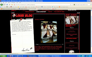
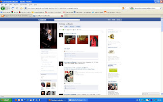
Many designers communicate with their clientele and fan base through the use of Blogs/Facebooks/Twitters. By designers using these they make themselves more available to different audiences, as well as being able to update clients easier than having to send out promotions and newsletter by post or e-mail. Blogs are usually used as the more formal and detailed internet use, whereas the twitter and Facebook are briefer but reach many more people.

My example of this comes from Christian Louboutin which is linked to the website; it is updated monthly and has about 12,000 followers, whereas the Louboutin twitter page which is updated throughout the day with photos, video links and news stories has over 26,000 followers. However the most successful is the Facebook page which has 414,000 likes, I think this is because Facebook is such a popular social networking choice and the posts that the page does are always relevant and interesting.

However I do admit I think I still prefer the updates coming through the letterbox, as receiving a beautifully printed card or brochure from Louboutin, Vivienne Westwood or Jo Malone is just a little more exciting than scrolling down your screen.

Perfect Prints

Digital Technology is now also greatly used to create prints and patterns for garments.

For example this season animal prints have been huge !. These prints would be made by finding an initial image, say a photograph of leopard fur, and cleaned up in a programme such as Photo-shop and then tiled repeatedly to create a large piece of print, then using the manufacture techniques from before, added to garments and cut out into fabric.

The pro of using Computers for print design is that it saves time and also gives you alot more choice. You can use photography or a drawn image that is then edited or even make one from scratch. The example I found for this was Alexander Mcqueen's Atlantis collection Jellyfish dresses, which was photography of different areas of a jellyfish, zoomed in to create great detail.


I loved the collection that much I bought the dress ... THE PRINT IS GORGEOUS ! It's detailed and the colours are amazing.

The only downside to using computer for print design is that it is becoming harder to find beautifully hand drawn/painted designs such as those of William Morris, who's prints I thought were so delicate and beautiful.

Digital Technology in Fashion design/manufacture

Also in this college project, we are looking at how digital technology is used throughout the fashion industry, so far I have only covered Illustration, but computer technology is currently used in most areas of Fashion.


Computer software programmes are now available to allow designers to play around with ideas without having to manufacture anything. These programmes can be used to draw out designs, create textures, adjust sizes, make patterns and sample fabric colours.

An example of this I found was during a documentary on Ozwald Boateng. He used special design programmes to mix his jewel colours for a range of shirts, this is also a lot less time consuming then going round dozens of fabric shops searching for colour swatches.

The only downside I see to this, is even with the most amazing software available, you cant get the exact sense of how a fabric will work through a computer screen, nor can you feel the
textures which are both huge factors when sampling with fabrics for garments.
(Boateng collection)

Pattern cutting pieces are very often now measured, drawn and cut using special computer software. This means the pattern can be produced in larger scales as well as saved and is easy to come back too. Also Digital Techniques can be used to make spec drawings, this results is high quality and being very clear and easy for a seamstress to follow.

The con however is that these garments are then mass produced, so if there is the smallest fault made in the early stages, ( which would be easily done considering the complexity of these programmes) the entire batch of that garment would be faulty and go to waste.

Gary Fernandez


The complete opposite to Blahnik, Gary Fernandez uses mainly digital techniques in his work. He is a very modern artists who uses a wide variety in every piece of his work to create really eye catching pieces.

Although Fernandez probably plans his work by hand drawings initially, the lines, curvature and colour in his work just don't seem achievable by hand. Therefore I believe he uses not only Photo-shop to enhance his work, but also probably a programme such as Illustrator to create the starting image.


Although this can't be classed as natural talent, I think Fernandez is a very talented artist because just as it takes huge talent to create beautiful hand drawn illustrations, you have to be very skilled to use Photo-shop to this level and it would still be a very time consuming process.
I lurveee the gold colour used in this piece, this is definitely something that would be hard to achieve with a set of watercolours !

Sunday, 12 December 2010

"About half my designs are controlled fantasy, 15 percent are total madness and the rest are bread-and-butter designs. "

After looking at all these artists who are mixing traditional with contemporary in their artwork i decided to look at someone who uses just traditional techniques, someone who not only creates amazing sketches ... but amazing shoes ... Mr Manolo Blahnik.


Since 1972 when Blahnik first started designing he created the most fantastic sketches of his design ideas. His drawing were very fine pencil lines, very angular and elongated. This style of drawing has become so iconic to Manolo, and the designs are that greatly appreciated that a book was published with a archive of his drawings. Even now at the age of 68 he continues to design fabulous shoes.

I have always been a fan of both Blahnik sketches & shoes, I really like the shape he uses for the foot with the skinny ankles and smoothly curved arcs and how because they are drawn freely by hand each foot is a slightly different shape or tone.


Saturday, 11 December 2010

Christian David Moore

I LOVE THESE PIECES !!!

The reason I like Moore's work so much is because, both the style of his drawings and what he actually draws really relate to my own interests, for example many of his works include famous brands, as well as shoes and make-up !!!

Some of his pieces are very traditional in the way they look like very simple water colour paintings, but at a closer look it is noticeable how clean the images are and how smooth the brush strokes are. Which hints at the aid of photo-shop to make his look just a little more professional.
Watercolours paints and inks are also prone to run and spread when added to a paper surface, which adds a slightly more naturally drawn effect, however it is very clear to see that Moore's backgrounds are bright white. This is probably also achieved by adjusting contrast levels via photo-shop.
This Chanel No.5 drawing I found in Victoria Beckham's book " The extra half an inch", is a good example of how he edits his work digitally for example the text on the drawing has been layered on top of the drawing, as well as the image itself being sharpened to give a more realistic image.

My favourite piece ...Mascara...can save a girls life.

Friday, 10 December 2010

Bec Winnel

Bec Winnel is a artist who I believe uses both traditional and contemporary techniques in her work, which is mainly based upon women with a very feminine girlie feel.


The traditional elements I see in her work is the highly detailed drawing. The drawings look like they would take hours as there is so much attention to detail and tonal shading to show a more life like look. I like this about her work because she is showing how talented she is as her drawing is a main part of her work.

To make her work more current however she also uses digital techniques. It is easy to see this by how smoothly blurred and blended the lines and colours are in the drawing. This creates even more life like structure in her artwork.

The Above is my favourite piece as it almost looks like a photograph that has been faded, the detail in the face is really defined and I especially like the shaded area under the face as it looks really realistic.

Wednesday, 8 December 2010

Carrie Bradshaw

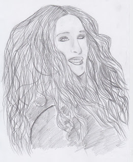
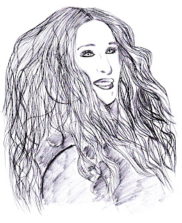
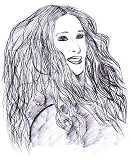
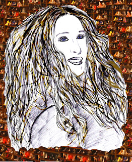
The next image I decided to photoshop was the drawing of Sex & the City actress Sarah Jessica Parker. I chose to draw her as its in keeping with my shoe theme, as she is the Queen of Manolo's !!!

The image obviously needed cleaning up as I used a 4B and 6B pencil which smudged quite heavily . Therefore I adjusted the levels to make the image a lot clearer and brighter.The image is now a lot clearer and looks more like its been drawn in biro or fineliner I also used the Blur tool on the shoulder and bust area to make the finish a little smoother.To define the facial features more. I used the magnetic lasso tool to select both the eyes and lips. I used the water-colour technique to apply colour to the eyes to make them stand out more, I also then sharpened the eyelashes to make them more of a feature. For the lips I used the smudge stick filter tool as it just separated them from the bright white background of the face.To add colour and more texture to my piece I used a opaque water-colour paint brush. Using this effect kept a slight transparent look, and made the pencil lines still show through. I like this effect as it adds a extra layer of texture to the drawing and is the best tool i have come across ro represent hair.


Using the clone stamp I have added a background to my image. By opening the background image in a blank document I was able to clone the pattern from one screen onto the other. I chose to use the Louboutin closet image as it is iconic to the character of Carrie Bradshaw.
I'am really happy with this final image as I feel the drawing looks more professional after being edited and adding the background gives a interesting effect. I think this image would also work well with a New York theme background for my drawing as New York is also iconic to Sex and the City.

Tuesday, 7 December 2010

Tall, dark and handsome ... Christian Louboutin Thigh High Boots

These are the gorgeous Christian Louboutin thigh high boots a gaze longingly at all day at work... they are beautiful and frankly my TOPSHOP ones just dot measure up.
Argghh well Tabbi ... keep saving !!!

My drawing does not do them justice !!!

Again I have cleaned up the images by adjusting the contrast colour levels to make it look sharper, brighter and more defined.
The finished image this time has both pros and cons. On the positive side I think the plastic wrap effect I used gave quite a similar effect to that of a shiny leather. Therefore it is a technique I may come back to for mark making techniques on initial design ideas.
However the outline I tried to achieve to emphasise the red of the sole, actually took the attention away from the red sole and the paintbrush tool I used to draw it with didn't give a smooth enough effect.

All in all ... I prefer the real thing !